What have you learned about the history of Graphic Design and specifically Poster Design?
 I have noticed that a poster design is to mainly captivate the attention of an audience with a picture as well as with a great message. This way the person viewing the picture will be caught on fast! I also noticed that through these mediums, artists have found a way of putting their emotions out there through art. Both, have similar objectives and those include, introducing an idea with the use of images, pictures and symbols. In other words, this is basically visual communication; through art!
Who is your favorite Graphic Designer? Where did they study and learn about Graphic Design?
I chose Siang Chang as my favorite designer. I chose her because I really like how her artwork produces her feelings. Her art includes patterns and colors that are alike. However, they are toned. I also thing her art is super girly, and that's what I liked most! She studied Graphic Design in Signapore, China. She graduated from a school called Nanyang Academy. There she obtained her bachelor's degree in Visual Communication.
What is their style of design?
The style of Siang's designs are mostly patterns. You can feel her joy through her work. In the designs I've seen, she uses a lot of colors that are mostly around the same base. For example, if she picks red she uses pink, light red, violet, white and so forth. So, she basically goes by a scale. That is my favorite part. I also like that her art is able to be viewed through many angles and that's what gives the illusions. Her art is just one structure. Moreover, her art is handmade.
1. How did you feel about using Adobe Photoshop? Was it easy, challenging &/or frustrating? Be sure to include the names and tools you used?🔨
I thought using Adobe Photoshop was extremely interesting. It made me feel like a professional photoshop technician. First, I created a layer of my face and started cropping. I used the rope tool to crop my image to be able to just leave myself with a white background. Then, I used the rope tool again to crop the background. Then I continued to feather my selected area. After this, step I filled my image with a red/burgundy color. Then, proceeded to add a box and a new layer, scaled it and filled it. Then, I added another new layer and text and added a cool word, "Rutilant" which by definition means glowing or glittering with red or golden light. I thought this word and definition went great with the color shade I chose. Overall, I thought this was a great application and would love to try this again.
2. What was your favorite and most interesting tool or procedure you used with Adobe Photoshop? How can you use Photoshop in the future and with what future projects?
My favorite part of this process was the rope tool. I enjoy this part the most because it was so easy to cut the unwanted parts out. If I ever want to crop an image to perfection I will take Photoshop into consideration. It will also help me to familiarize more with the application. For example, if I want to post an Instagram picture and I want to look like Kim Kardashian, I'll use this.
1. Why is a good critique of our design work so important?
I learned that a good critique helps the designer strengthen their communication skills to their viewers and as a designer. The criticism will eventually help the designer by motivating them to keep producing great work. This is because an audience will tell you what they like the most and then what they didn't like as much. This will be honest and soft and will avoid hurting anyone's feelings a little too much.

What did you learn about the importance of typing correctly?
I believe that learning how to type properly has many benefits. I like to think that it helps with posture. It lowers the risks of developing a hunchback. I also think it's nice to be able to type fast without having to pause to look for the letters. Likely, I think it will be a great advantage when it's time to look for a professional job that requires computer skills. It also helps conserve time, since we teenagers are always in a rush when it comes to homework.
What are your next steps? How do you plan on being able to type faster and have to look at the keyboard?
I want to keep improving. I know I don't type all that perfect, but thats okay because I will keep trying. I also believe that this method with open many doors in the future. Many companies look for employees who are efficient in computer skills and can type certain documents in a short period of time. I will try and remember to divide the keyboard in the middle or I can have a wallpaper of a keyboard to know where the letters are.
 A. What key points did you utilize to design your logo?
The key points I used were, having a good choice of color, fonts and aiming towards the desired audience. I chose the colors yellow and pink because I think they really tie together. The font that I used is sort of cursive which many real flower shops use in their logos.
B. How do you know your logo design is successful?
I know my logo design is successful because it clearly shows who and what it's for; flower shoppers. It also catches the viewers eye because of the colors I applied. I think the detail I included in the black and white version is unique and you don't see it everywhere.
A. What key points did you utilize to design your logo?
The key points I used were, having a good choice of color, fonts and aiming towards the desired audience. I chose the colors yellow and pink because I think they really tie together. The font that I used is sort of cursive which many real flower shops use in their logos.
B. How do you know your logo design is successful?
I know my logo design is successful because it clearly shows who and what it's for; flower shoppers. It also catches the viewers eye because of the colors I applied. I think the detail I included in the black and white version is unique and you don't see it everywhere.
 1. What have you learned about Adobe Illustrator tools?
I learned that Adobe Illustrator has many capacitated tools to help change and personalize an image. From coloring to resizing, to merging, Adobe Illustrator can come in handy if you ever have to design your own logo. Perhaps it may even be useful for drawing!
1. What have you learned about Adobe Illustrator tools?
I learned that Adobe Illustrator has many capacitated tools to help change and personalize an image. From coloring to resizing, to merging, Adobe Illustrator can come in handy if you ever have to design your own logo. Perhaps it may even be useful for drawing!
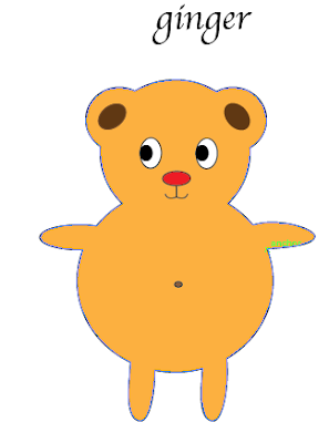
2. Screenshot a picture of something you have created on Illustrator and describe what you created and how. Be sure to name the tools you used. Did you enjoy it? How difficult was it?
Above, is a screen grab of an image I created on Illustrator. I enjoy getting to know this software because I'm always looking to learn new things. I find it great how technology has evolved and how we can create an amazing art piece with just a few clicks. For my piece I utilized the following tools: Lasso tool, Blend tool, Rotate/Reflect tool, Shapes, & the Text tool. I thought it was easy but definitely took time to really personalize it. My piece is titled "Ginger", because it reminds me of my favorite color.

1. Write a quick reflection of what you just saw explained in the Mind Map video and what you understood about it.
I learned that there are many tools when it comes to communicating through graphics. Also, you must include mediums that will catch the viewers eye. There's a specific way to editing pictures that can actually show what the company is actually focusing on.
2. Have you ever used Mindomo? Even if you have never used Mindomo how would you use Mindomo for a project in the future think about mind maps and visual communication.
I think I would use Mindomo if I ever had to create a colorful mindmap and involve many pictures into it. Basically, if I had to bring it to life I'd definitely utilize Mindomo. I think it is a great program to really succeed in the Graphic Imaging industry.

 I have noticed that a poster design is to mainly captivate the attention of an audience with a picture as well as with a great message. This way the person viewing the picture will be caught on fast! I also noticed that through these mediums, artists have found a way of putting their emotions out there through art. Both, have similar objectives and those include, introducing an idea with the use of images, pictures and symbols. In other words, this is basically visual communication; through art!


